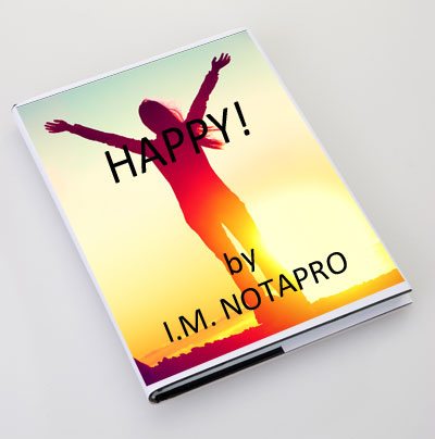
 Mistake #2. Design Your Own Cover!
You’ve heard the old saying; “You can’t judge a book by its cover”? Unfortunately, that’s exactly what happens; your book will be judged by its cover. In the span of a few seconds a potential reader, reviewer or professional book buyer will decide whether or not to pick up your book to look inside – based on its cover.
Your Title – ‘a rose by any other name …’
One of the most common, most obvious mistakes made by self-published authors is putting a title on their book that means the world to them … but not a thing to anyone else. As we discussed in the last chapter, because you are the author of your book, you’re closer than anyone else in the world to it. The title you’ve chosen for it might be very meaningful to you and completely meaningless to the rest of the world.
The problem is, of course, that your book’s potential readers probably don’t know the context of your work and may not understand the depth of your topic. Choose your book’s title for your readers, not for you.
One of our very popular authors wrote a book based on his many years of clinical work with drug addicts and other codependent patients. The book’s suggested title was, Escape the Grip of Codependency. After all, that was exactly the result of years of counseling – helping clients ‘escape the grip of codependency.’ But that title came from the author’s context of his work, not from the context of the thousands of potential readers his book could help. In most cases, the audience he was trying to reach weren’t aware that their lives were ‘in the grip’ anything, and they didn’t know the definition of ‘codependency’. All they knew was that their situation was a mess and they needed some way to take control of their lives. We decided, for the intended audience, to title the book, Take Control of Your Life. That was a title readers understood!
The title of your book, like everything else on the cover, is there for one reason – to sell books. Unless you’re too weird or too rich, you won’t be buying your book, your readers will; the title is for them.
Your Cover Art – ‘baby pictures … ugh!’
I love baby pictures! Well … let me qualify that. I love baby pictures of my babies. For those of us who have had babies and/or grand-babies, what’s the first thing we do with our new baby pictures after we’ve ooh’d and ahh’d over them? We show them to anyone and everyone in our path – friends, neighbors, family, total strangers, everyone. We’re so enraptured by the sight of our baby we just know that everyone in the living world will be too. The truth is, although others may give us a polite “awe!” or “that’s cute,” they’re not really too interested. It’s not their baby.
It can be the same way for the ‘perfect’ artwork you’ve chosen for your book. You may love it like your own baby. After all, your book and its cover, like your own children, are extremely personal to you – you’ve worked hard giving birth to them. The reality, though, is that the reading world is a cold hard place; they’ll never care as much about your book and its cover as you do. The cover art for your book, like its title, is there for just one reason – to sell books. The art you choose for your book’s cover is there for your potential reader; to make him or her stop and engage.
The Back Cover – ‘you’ve hooked ‘em, now reel ‘em in!’
One of the first things I learned in the publishing business was this: “Your front cover’s job is to get browsers to pick up the book and read the back cover. The job of the back cover is to get them to read the first page.” Your book’s cover is a sales tool, plain and simple. Your back cover has two main functions (besides a few others we will discuss later).
The first function of the back cover is to show the reader how he or she will benefit from what’s inside your book. Some call this part the ‘synopsis’, we call it a ‘blurb’; you want your reader to call it, ‘the reason I bought this book.’ When creating copy (the blurb) focus on benefits (what this book will do for the reader) instead of feature (content included in the book).
Features may include:
- 100 heart-healthy recipes
- 8 workout plans
- 10 ways to say no to chocolate
Benefits may include:
- Lose weight and eat great
- Live with more energy than ever
- Eat the food you love
Do you see the difference? Features are causes – what you have to do to get the benefit. Benefits are effects – the results you experience when you engage the features. Believe me, people will buy your book for the benefits, not the features. Focus on the benefits readers will receive from the book more than the features inside the book.
Bio – ‘oh, my-o’
If I haven’t said this enough already, let me say it again – your book and its cover, to be effective, is all about the reader – not about you. Your bio is on the back cover for one reason – you know already – to help sell the book. Your bio tells potential readers why they should be taking advice from you. If your book is about eradicating crabgrass and you’ve won the National Beautiful Yard Contest five years in a row, that’s important. Readers need to know that. Unless your book is about scouting or baking, the fact that you were an Eagle Scout or won the County Fair brownie contest might not be a relevant bio element for this book.
It’s okay to mention in your bio that you, your life-mate, six children and Great Dane live on a farm in Vermont (if it’s true), that kind of information can make you human and more accessible to your readers (just don’t give your street address). But remember, the main purpose of your bio is to qualify you as an authority in your book’s subject matter.
Are You a Graphic Artist? – now is a lousy time to start learning
 I’ve run a publishing company for nine years; we’ve published over one hundred different titles for more than sixty authors. I’ve trained myself to be proficient in all of the design software used in our business; I know what makes a good book cover and what doesn’t. I’ve designed some of our book covers, I don’t anymore. Want to know why? I’m not a graphic artist. I may know more about designing book covers than most graphics artists, but I’m not a graphic artist. I can paint a house, but I can’t paint a sunset.
All of the major book cover elements we’ve discussed will fail to serve their highest purpose if they’re not presented properly and professionally on the pallet that is your book’s cover. The number one visual indicator of a ‘self-published’ book for professionals (publishers, distributors, retailers, critics, radio and TV hosts, etc.) as well as sophisticated readers is the cover. The response to a book cover that cries out “amateur!” is immediate and detrimental (remember, a book is judged by its cover). Plain and simple – those people and entities most familiar with the book world, who could help the sales, distribution, publicity, and reviews of your book will think twice before they commit time, resources and reputation on a book with an ‘amateur’ cover.
It’s possible to design your own book cover, but unless you’re a graphic artist I’d recommend getting a professional. Your book will wear that jacket all of its life, and you want its life to be long and successful.
What do you think about this self-publishing mistake? Any ideas? We’d love to hear from you, please comment.
About me:
I’m a self-published author. My first self-published book, Breaking the Treasure Code: The Hunt for Israel’s Oil sold about 20,000 copies … okay, I guess. Since then, between the self-publishing companies I started and bought, we’ve sold close to one million books.
Let me tell you, in the beginning, I didn’t know much about writing a book, and knew nothing about publishing, printing, marketing and selling books! If I had known anything, I might have walked away, overwhelmed with the whole process. Successfully self-publishing can, at times, seem hopeless. But I stuck to it, learned a lot about publishing, even more about marketing and selling, and, through lots of practice, sharpened my writing skills.
Even so, there are countless, landmines, booby-traps, dead-ends and just plain mistakes a self-published author can make. This is the second of ten weekly blog posts. They come from my e-book: The Ten Biggest Mistakes Self-Published Authors Make. This little book captures ten of the most common, most detrimental mistakes you can make as a self-published author and, hopefully, how to avoid them. I wanted to put these mistakes out in a blog format so you can comment, ask questions and we can discuss ways to make your book as successful as it can possibly be.