Your Medium
Dynamics of a Successful Book: Lesson 3People do judge a book by its cover, and its interior. The quality of your book’s presentation is a reflection of the quality of your message. Beyond the aesthetics of your cover and interior, professionals know that your cover and your pages have a job to do; to pique the interest of browsers and keep readers engaged. If you’re serious about your message, be serious about its presentation.
Steve Spillman, Founder, True Potential
“Self-published books quite easily fall into two categories:
- Books almost entirely created and produced by the authors
- Books created by book professionals
And you simply can’t mistake one for the other. It’s extremely rare to run into someone who can learn to produce a professional-looking book without professional experience.”
Lesson 3:
Three questions to ask about your book design:

Question 1: Is my book cover designed to grab attention and create interest?
They say, “Don’t judge a book by its cover.”
Unfortunately, most people do. The front cover image, the font in the title, the back cover text, the spine, even the barcode (I’m not kidding).
The purpose of a front cover is to get your potential reader’s attention enough to pick the book up and turn it over to read the back cover. In the online world, your cover should interrupt the reader’s browsing enough to consider finding out more about the book.
The art, the title, and the text of a book cover must all blend into a well-designed, cohesive, professional whole, and be geared toward the reader’s perception (not the author’s). Grab attention, create interest and create the desire to discover more.
Why and how a book cover is designed (front, spine, and back) is extremely important to your book’s success and, unfortunately, something most self-publishing companies won’t tell you. Too often, authors have to discover this lesson the hard way, when no one seems interested enough in the cover to pick up the book and explore more.
Question 2: Is my book’s interior designed to be easier to read and keep my reader’s attention?
If your potential readers get past the cover they may also judge your book by its interior; how the text on the pages is laid out, the font and font size, white space, interesting focal points like important quotes pulled out from the text. Even if the judgments aren’t fully conscious, they still may be there. If the font inside is too small, too crowded or not broken up by white space a reader can judge your book as too daunting a task to begin.
The kind of font a book uses even makes a difference to the reader.
Did you know that professional publishers use “serif” fonts in books because long blocks of text are easier to read in a serif font?
(This is a serif font. This is a sans-serif font.)
The little tails in the letters of a serif font act to carry the reader along in the text. On the other hand, blog posts (like this) and web pages generally use “sans-serif fonts because they’re easier to read in short blocks and on a computer or mobile screen.
By the way, the term “sans-serif” comes from two words; the word “sans” is French for “without” and the word “serif,” we think (nobody is sure) come from a Dutch word meaning “tail” or “stroke,” like the “stroke of a pen. Did you notice the little tails or strokes at the tips of each letter in the “serif” sample above? Do you see that there aren’t any tails or strokes at the tips of the “sans-serif” (without-tails) letters in the sample above?

Question 3: Is my book’s interior designed to enhance the reading experience?
How about white space? That’s the amount of open (white) area on the page between lines, paragraphs, and margins.
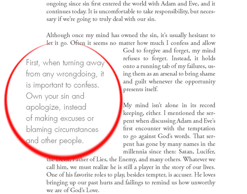
How about visual highlights like “pull-outs”? These are important quotes “pulled out” from the text body in a larger and different font.
We won’t go into professional editing in this lesson, but let me add that misspellings or the obvious use of a wrong word in a wrong place can kill your reader’s interest and damage your perceived reputation as an authority on your subject.
I know that many of these details of creating a book that appeals to the reader’s senses may seem too technical or even trivial, but they’re not, and your book sales or lack thereof, will prove it out.
Homework
- Review a small 1″ x 2″ image of your front cover. Can you read the title clearly? This is about how big the cover image will appear on Amazon. Would a stranger understand anything about your book from a cover image this size?
- Review your back cover text. Does it clearly explain to the reader what to expect inside?
- Review your book’s interior pages. Does the page design allow the reader’s eyes and attention to easily flow down the page and invite her to continue reading or does it look like a sea of words with no breaks?
Hey! Do you have a question for me about this lesson? I’d love to give you an answer! Just scroll down to the comment section below and ask away.
⇐ Click here for lesson 2:
Your Audience
Click here for lesson 4: ⇒
Your Network
We’d love to help you reach the world with your book. Just let us know where you are in the publishing process by completing the form below. Talk to you soon!